Case Study
UOB FX Disruption

PROJECT SUMMARY
Aleph Labs was engaged by UOB Singapore to design for a new feature within the UOB Mighty mobile app, to support the bank's upcoming Foreign Currency Exchange account type.
The Team:
-
Project Manager
-
Design Director
-
UX Researcher
-
Copywriter
-
UI Designer (Me)
The project went live in 2017.

An overview of the activities done over the course of the project.
Who?
Personas that were provided when I joined the project:

What?
-
Design a new feature on the mobile app that will cater to the target audience to utilise the foreign currency exchange service.
Why?
-
Target audience can check exact rates and do the exchange regardless of time and location.
-
Bank can cater to their target audience’s needs and get more account sign ups.
PROCESS
1. DISCOVER
How are the target audience achieving their goal at the moment?
What are the steps that they are taking?
How are they feeling during each step?
Is there any opportunity to make a particular step better?
We tried to get the answers to these questions by crafting the user journey map for both of the given personas. A workshop was conducted with our clients’ subject experts. This helped us to address the scenarios from their perspective.

Workshops held in the client’s office.
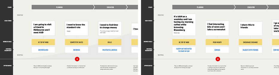
A screenshot of the digitalised Jenny (left) and Adrian (right) customer journeys.
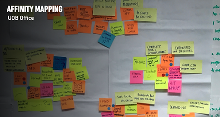
Post its grouped according to their similarities.
Since the service will be catered to a mass audience, we looked at common behaviours, emotions and opportunities from both personas’ journey map.
They are then grouped based on their relationships for review and analysis.

Pros and cons from other products.
2. DEFINE
After the team has some understanding of the requirements and market standards, we came together to draw up some rough sketches of possible solutions.
We then voted on parts that could be assembled into a possible solution.

Crazy sketches – multiple idealised solution within a limited time.
I created a flowchart to visualise where this new feature will be placed in the existing app. It was printed out and placed in the office where the mobile app developers were. This encouraged discussions and helped to define the navigational flow and screens required.
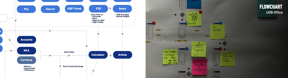
Screenshot of digitalised flowchart (left) and printed copy with additional remarks (right).
3. DEVELOP
In the 1st stage of testing, we checked if users are able to understand the content and element of the selected flow.
Some of the questions addressed:
Where will the users click to check exchange rates?
What is an intuitive layout for users to immediately understand that exchange rates are being shown?
At this stage, some layouts that we were considering were references from the calculator, wheels, dials, charts and drop downs.

Testing materials and iterations.
Wireframe Testing
Iterations were made after each round of testing.
The wireframes were refined and put together in a flow to test if users were able to navigate and complete the required tasks.

Wireframes in Sketch.
Hi-fi Testing
The wireframes gradually evolved to hi-fi mockups

One of the mockup iteration and navigational flow.
4. DELIVER
After 2 weeks of testing with a total of 49 screens and 30 users, the designs were delivered.

Some key screens.

UI Kit
OUTCOME
This project went live late 2017.
Looking back, I am immensely grateful that this project was well structured and documented by our Design Director.
Some of the plus side of working within an agency, is that the existing know-hows and resources that we can tap upon.
However, the scope is usually fixed so we are unable to have visibility to how our solution performed.
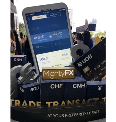
Roadshow in Jan 2018